ZEPEL
Rebranding and Design Proposal
Zepel is a startup that aims to facilitate small and medium apparel and accessories businesses with smart sourcing solutions.
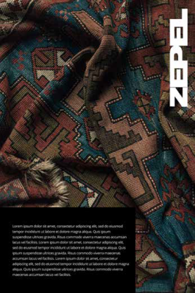
As the client wants to target small and medium businesses like street brands, Zepel needs character. Zepel needs style. Zepel needs the blue banana kick.
Zepel,s position in the market will not just be of a textile sourcer, apparel manufacturer or a printing / embroidery expert.
Zepel will be a design leader in the B2B space. A supplier that truly understands the business when it comes to trends, design, and flawless execution which is as agile as can be.
This demands Zepel to be bold, up to date with trends, and having a design system across the digital realm that aligns with the target audience.
#BCF904
BCF904
BCF904
#5D29F1
- Agilen
- Quality
- Conscious
- Facilitation
- Network
- Youthful
- Cool
- Modern
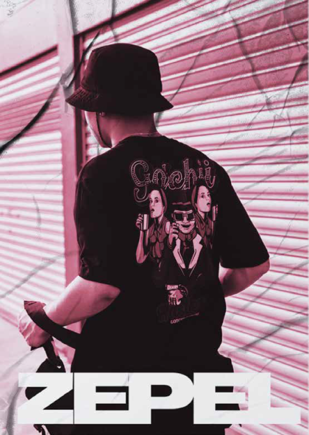
- High Street Fashion
- Pop Culture
- Hip Hop
- Crypto
- Skateboard Culture
- Hype Culture
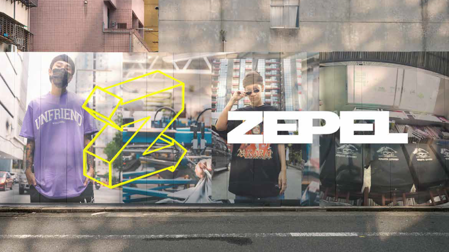
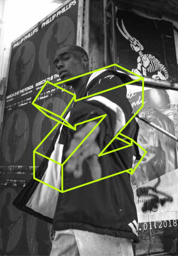
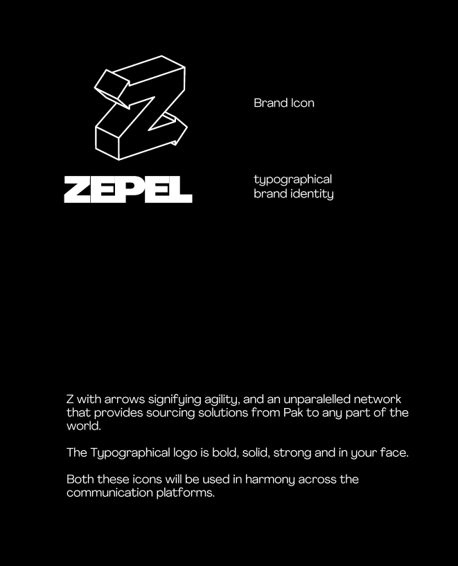
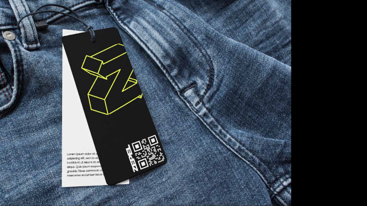
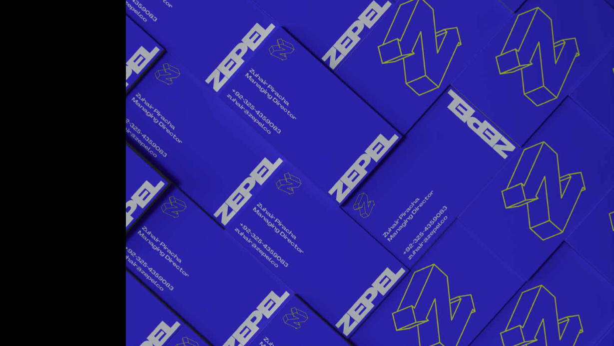
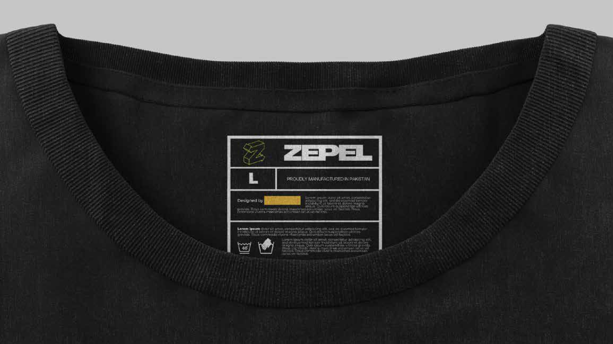
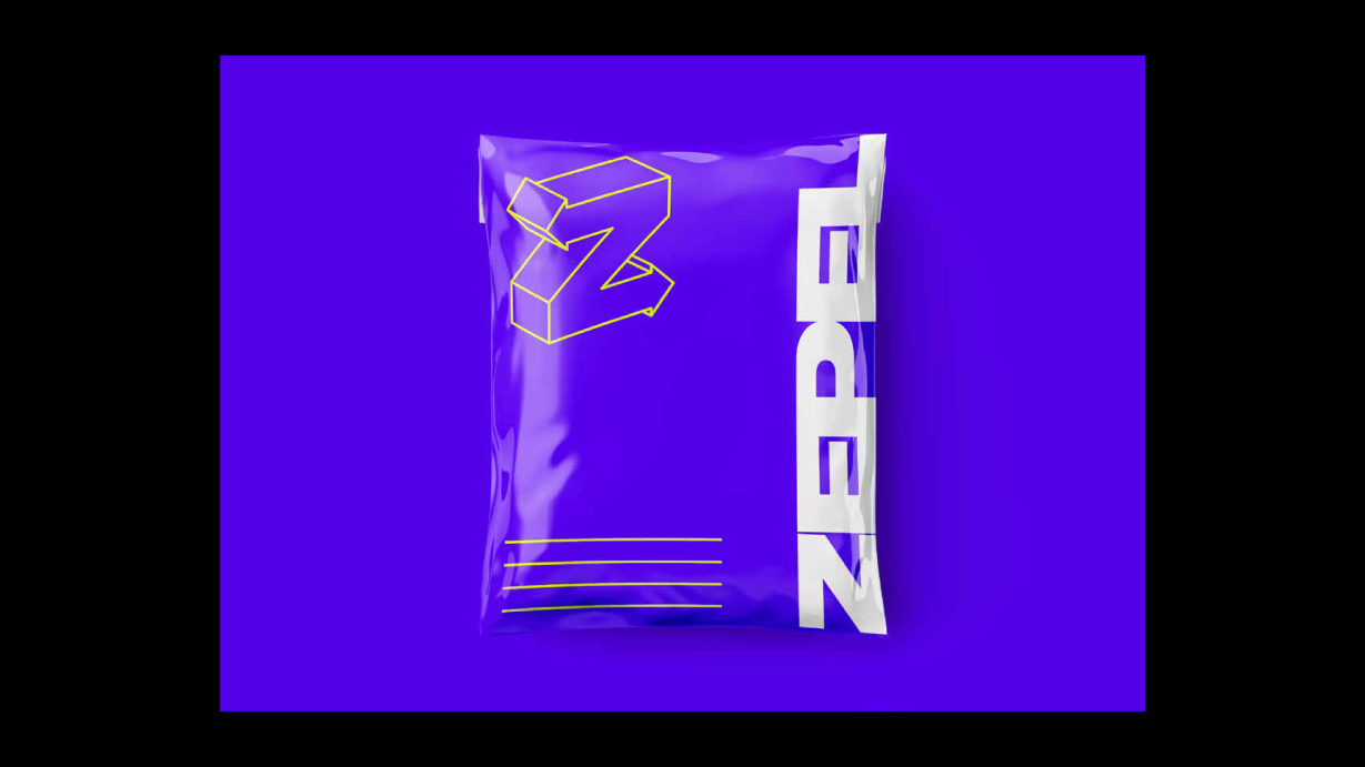
We chose to manipulate the letter Z as the main brand mark due to several reasons:
1) Z has a very agile profile.
2) Z ’ s profile can be used to show networking from point a to b, showing we export and provide sourcing solutions from pakistan to anywhere in the globe.
3)Arrows Denote agility, facilitation and networking.
Brand Color Palette is vibrant, and strikes the viewer at the first glance.
Neon green is used to represent modernity, agility and a quirk that brand designers and creative directors get.
Purple is premium service. Purple is professional Purple is also unorthodox and modern.