CREMME
Rebranding and Design Proposal
Cremme's visual identity should highlight the innovative aspect, as the main differentiator is the proactive approach Cremme takes to add value adding features.
It should also highlight being agile and precise in it's service, as this value is at the core of any and every ecommerce business.
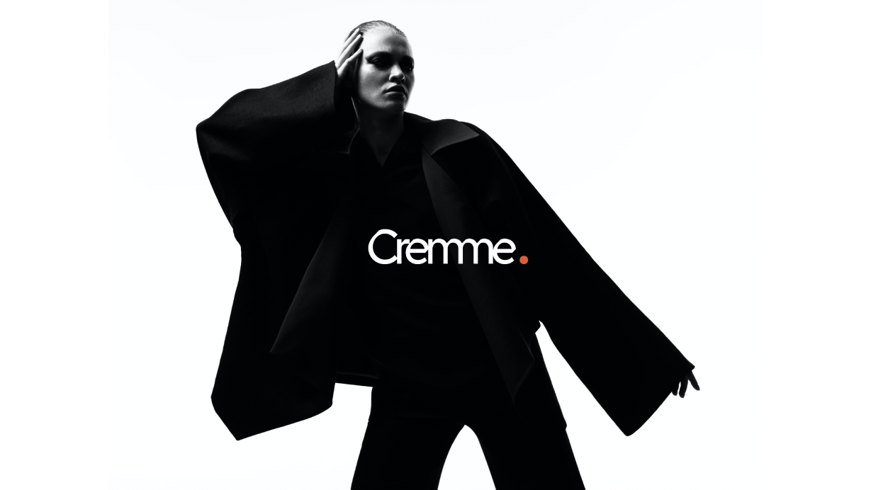
Color that resonates with our future vibe. Cremme has to have a colour that accentuates the youthful vibrant digital world we live in.
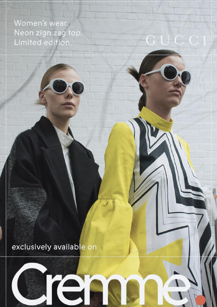
A place of collaboration. A place where brands and customers unite. Where every new product release excites.
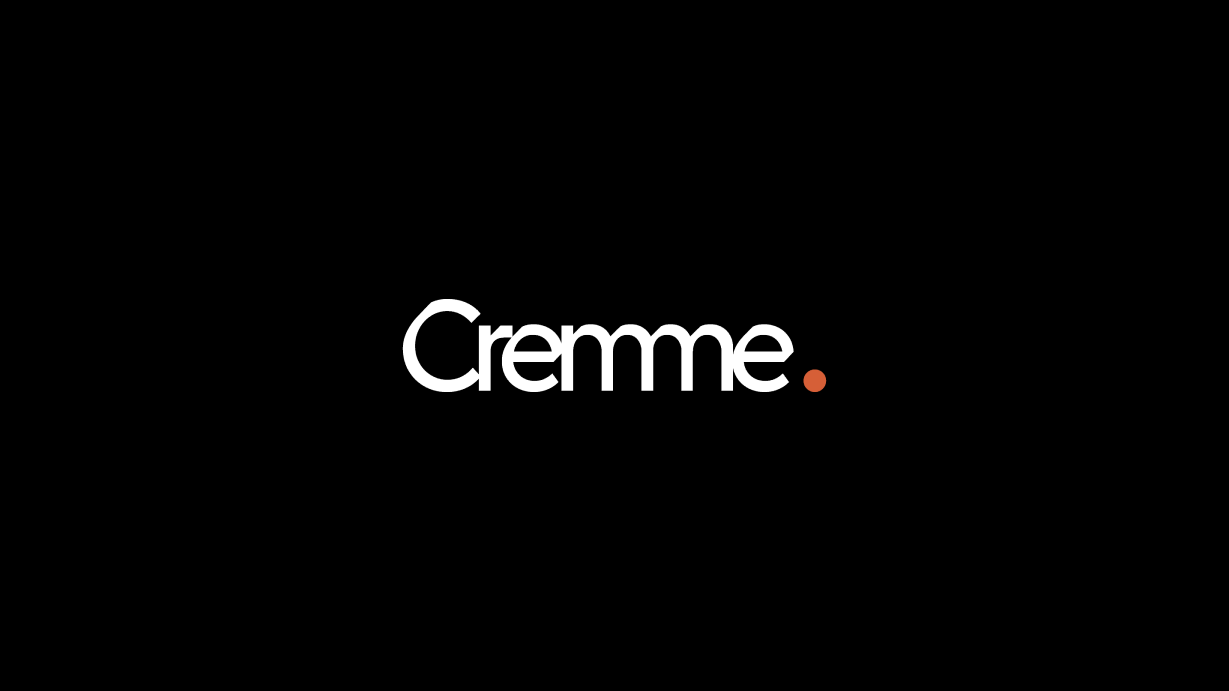
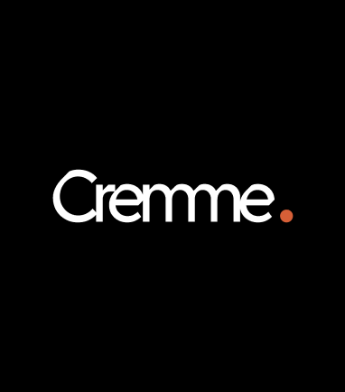
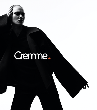
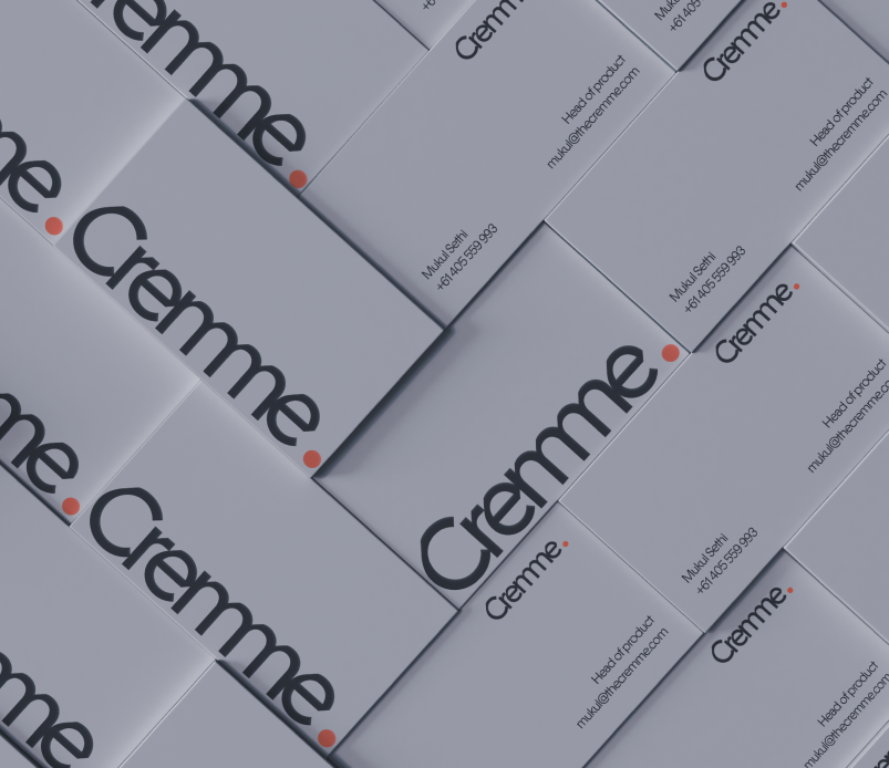
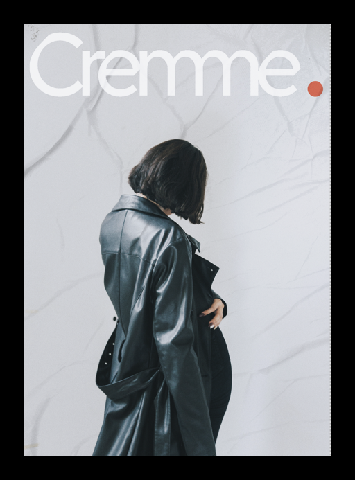
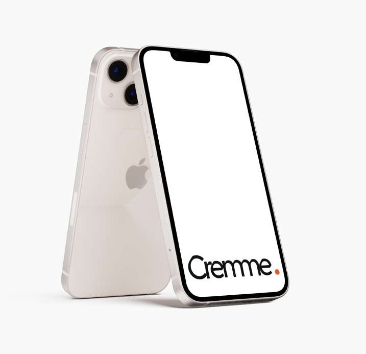
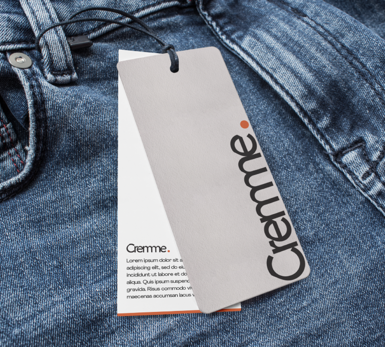
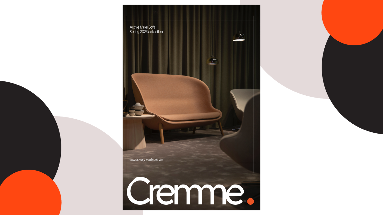
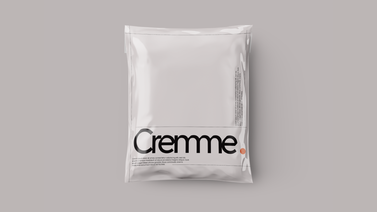
The typography as the main element of the Brand identity needs to be minimal and flat, but also has to have character. A type that's twisted a bit for the future, but not too much.


- Innovative
- Brand Representation
- Data Driven
- Ethical and sustainable
- Culture Driven
- Engaging & personalized
- Trust
- Product portfolio
- Price.

Slight cuts at an angle give this type based identity a modern, futuristic twist.
The forward angle also signifies agility, a proactive approach in gathering and facilitating Trends in products, and also the data driven precision.
All in all, the identity, together with a minimal design system will set apart nicely from the crowd.
With White and beige being the dominant parts of the Cremme Color spectrum, the orange is selected just to give an extra character to the brand.
Orange combines the energy of red and the happiness of yellow for a warm, confident, fun hue. The color increases oxygen to the brain, which stimulates mental activity and creativity.
The tone of orange is bright, to pop out in the digital age, and to feel like a color from the future.